Designing High-Converting Shoppable Experiences for 2026
What Makes Shoppable Creative Convert?
Today’s consumers move fluidly between media, retailer sites, social platforms, and brand websites before making a purchase. Yet many commerce experiences still create unnecessary friction at the moment of intent.
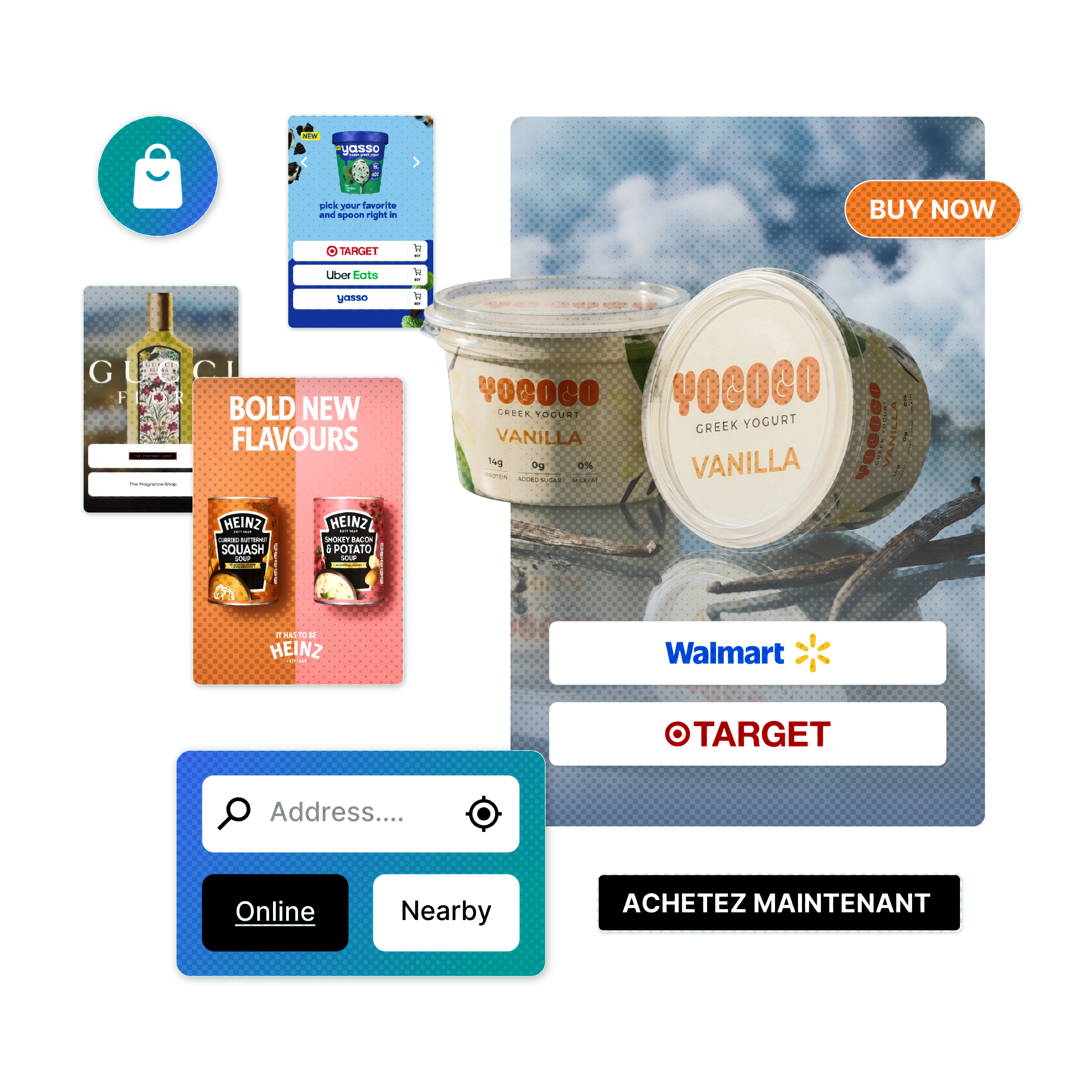
The most effective shoppable creative does more than grab attention. It makes buying easier, boosts conversions, improves retailer results, and provides useful commerce insights across channels.
By combining seamless shopping experiences with real-time commerce intelligence, brands can unlock benefits beyond sales. They can:
-
Respect consumers by offering flexible retailer options that suit their needs
-
Empower marketers with actionable first-party insights that improve performance
-
Strengthen retailer relationships by driving high-intent traffic and increasing conversion
To unlock the full value of commerce enablement, every touchpoint, from owned brand experiences to paid media, must be optimized along the path to purchase.
Here’s how leading brands design commerce-enabled creative with MikMak to remove barriers and accelerate conversion across brand websites and shoppable media campaigns.
Creative Best Practices for Brand Website Commerce Enablement
Commerce enablement software provides the infrastructure, while creative design determines how effectively shopper intent turns into action.
Your “Where to Buy” experience should guide consumers seamlessly from discovery to conversion, driving traffic to retail partners.
Optimizing this starts with how purchase opportunities appear across your website.
Make Multi-Retailer Checkout Options Visible and Effortless
Difficulty finding where to buy a product is one of the biggest friction points in the shopper journey. High-performing brands make purchase options visible throughout the browsing experience, surfacing their “Where to Buy” functionality across homepages, product detail pages, and high-traffic landing pages.
They follow a few core principles to reduce barriers and accelerate conversion:
✅ Easy to find
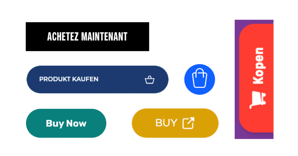
Use clear, high-contrast CTAs like “Buy Now” or “Where to Buy” that stand out visually while remaining consistent with your brand identity.
✅ Minimal clicks
Minimize the distance between intent and action. A persistent CTA button, header navigation link, and in-page shopping display help shoppers access purchase options without interrupting their browsing journey.
✅ Omnichannel choices
Beyond visibility, shoppers also expect flexibility in how and where they purchase. Brands should show both online and in-store retailers within a single shopping experience, with retailer options organized through tabs or displayed together in the order that best fits your conversion strategy.
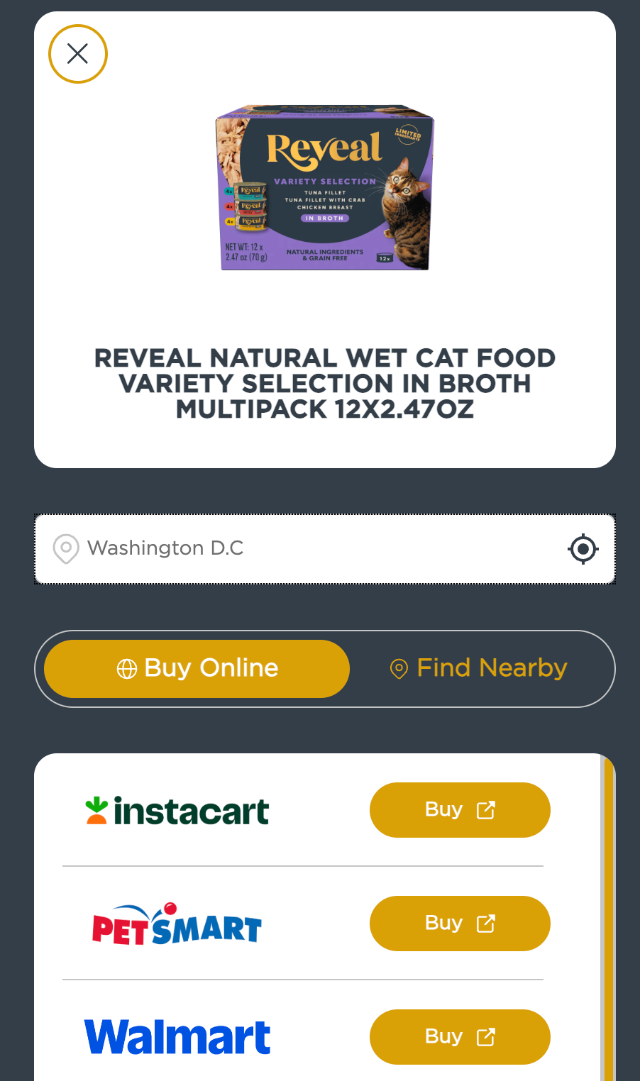
🐾 Brand Example: Reveal - Seamless Shopping Online and In-StoreReveal simplifies omnichannel shopping by helping users instantly choose between online purchasing and nearby retail availability. “Buy Online” and “Find Nearby” tabs allow shoppers to browse options based on their preferences and location. |
 |
Streamline the “Where to Buy” Experience
Visibility is only the first step. Once shoppers engage with a “Buy” CTA, the shopping experience itself should feel fast and intuitive.
Visitors come to your brand website to discover products, compare options, and move confidently toward purchase. At this stage of the journey, slow load times or clunky interfaces can create unnecessary friction and lead to shopper drop-off.
To create a smoother path to purchase:
-
Optimize product image quality, sizing, and consistency
-
Keep product titles and descriptions clear and easy to scan
-
Use carousels or tabs to simplify product browsing
-
Ensure retailer availability updates in real time based on shopper selection
Bioderma demonstrates how streamlined navigation and integrated retailer visibility can support both DTC and retail discovery within the same experience.
Prioritize Mobile-Friendly, Fast-Loading Experiences
A frictionless commerce journey must perform consistently across every device, especially mobile, where most shopping journeys begin. With over 60% of web traffic coming from mobile, speed and usability are key to reducing drop-off and driving conversion.
Commerce experiences should feel native across desktop, mobile, social, and video environments.
Key principles:
✅ Speed matters
Commerce experiences should load as quickly as the rest of your site content to keep shoppers engaged and reduce abandonment.
✅ Mobile-friendly UX
Use large CTA buttons, simple filters, and swipeable product carousels to make browsing and purchasing effortless on smaller screens.
✅ Unified branding
Maintain a consistent UI, shopping flow, and checkout experience across your website, social ads, and video content to create a cohesive shopper journey.
Premier Protein demonstrates how mobile-first commerce design can maintain speed and usability across devices.
Flexible Design: Templates and Custom Experiences
Different pages and shopper journeys require different commerce experiences. The right format depends on your site structure, product catalog, brand guidelines, and conversion goals.
Brands using MikMak choose from a wide range of customizable templates to integrate “Where to Buy” functionality into any website environment. Different configurations can be used across your website, from product detail pages to dedicated shopping hubs, while maintaining a consistent brand experience.
Core formats include:
- In-Page: Shopping options displayed directly within page content
- Drawer: A sliding shopping interface triggered by a CTA
- Pop-In: An overlay shopping window displayed on top of the page
- “Where to Buy” Page: A dedicated shopping destination with product discovery and filtering capabilities
For brands requiring more advanced customization, MikMak’s Headless Commerce API enables fully tailored commerce experiences across both brand websites and shoppable media environments.
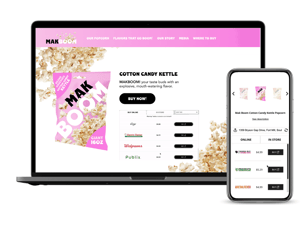
In-Page
The “Where to Buy” experience is embedded directly within the page, allowing shoppers to browse online and in-store purchase options without leaving the content experience.
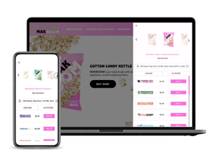
Drawer
The “Where to Buy” interface opens as a sliding drawer alongside the current page, giving shoppers quick access to retailer options while maintaining browsing continuity.
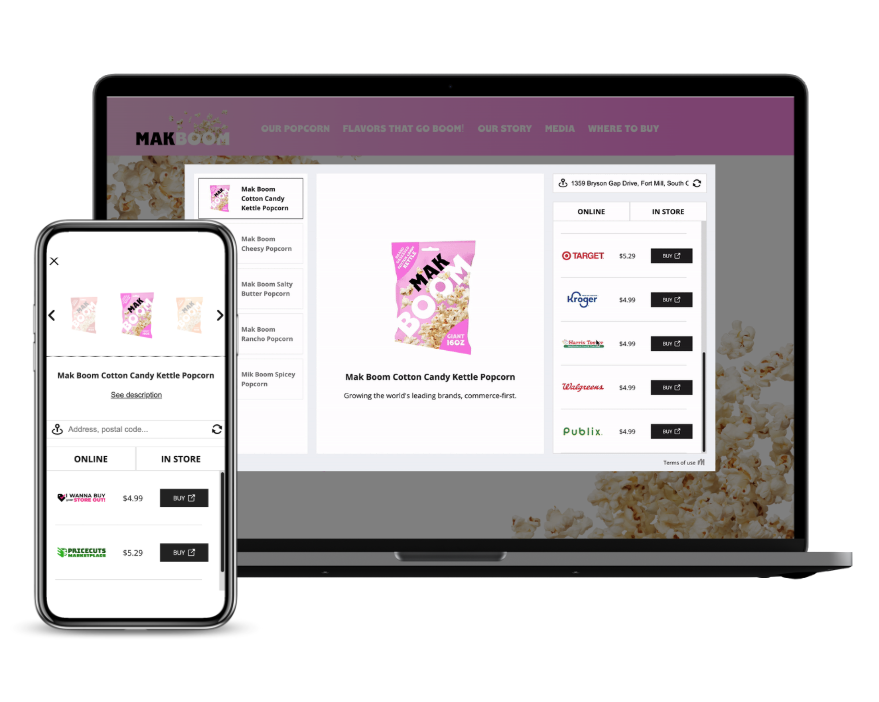
Pop-In
The “Where to Buy” experience appears as an overlay window on top of the current page, creating a focused shopping interaction.
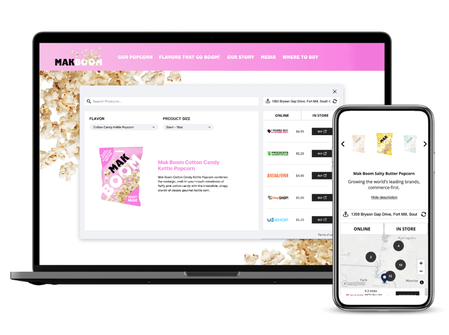
Where to Buy Page
A dedicated shopping landing page that can showcase products in a carousel with dynamically updated online and in-store purchase options. Custom layouts also include filtering to simplify browsing across larger catalogs.
Creative Best Practices for Media Commerce Enablement
Media does more than build awareness. Over 40% of consumers click on online ads with the intent to buy. MikMak data consistently shows that media channels are a primary source of high-intent shopper traffic to brands’ retailer partners.
Shoppable media turns that intent into measurable outcomes by connecting creative and commerce, guiding shoppers from discovery to purchase.
Optimizing Shoppable Media Experiences
Performance in shoppable media is not one-size-fits-all. The most effective creative setup depends on campaign objectives, brand guidelines, product category, and whether the goal is online purchase or in-store discovery.
For this reason, leading brands continuously test and optimize creative formats through A/B testing and iteration rather than relying on fixed rules.
The examples below highlight strong-performing creative approaches across formats and experience types. They illustrate how brands bring commerce to life in practice, rather than prescribing a single optimal approach, since performance varies by context and objective.
Principles of Effective Shoppable Media Design
High-performing shoppable media balances storytelling, visual impact, and easy access to purchase. The goal is to capture attention quickly while keeping the path to conversion clear and intuitive.
✅ The 3-second rule
A clear product shot should appear within the first three seconds of the experience. This ensures immediate recognition and anchors the shopper in the product story before attention drops.
✅ Design for every screen
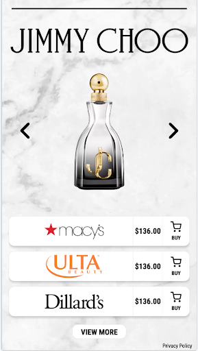
Mobile and desktop require different creative treatments to ensure clarity, usability, and conversion performance. Design separate shoppable media creatives for mobile (9:16) and desktop (16:9), and account for margins and safe zones to keep key elements visible.
✅ Use visual hierarchy to guide attention
Great creative naturally leads the eye from inspiration to action. Visual structure should keep the product as the focal point while clearly guiding users toward commerce interactions.
Best practices:
|
 |
 |
|
|
|
✅ Preview and refine creative before launch
High-performing shoppable media is often the result of continuous testing and iteration. With MikMak, brands can preview shoppable assets across desktop and mobile environments before launch, making it easier to refine layouts, improve visibility, and optimize the shopper experience.
Previewing creative across formats helps ensure that key visual and commerce elements remain clear, accessible, and conversion-friendly on every screen.
🪥 Brand Example: Personal Care
When using a custom mobile asset for a single-product experience, it is important to ensure that key product visuals and background imagery remain visible and are not obscured by commerce UI elements such as buttons or retailer modules.
The example below shows how a Personal Care brand optimized its creative layout to improve product visibility and overall shoppability across mobile experiences.
|
Before
|
After
|

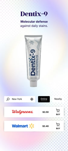
Strong shoppable creative ensures attention is not only captured, but directed. Every visual element should support clarity, product focus, and a clear path to purchase without overwhelming the experience.
Match the Commerce Experience to the Campaign
Different campaign objectives require different commerce experiences. The most effective shoppable media adapts to the role each ad plays in the funnel.
MikMak offers a range of customizable shoppable media templates designed to support single-product and multi-product campaigns across different objectives.
Core formats include:
With MikMak, brands can turn any ad into a smooth shopping experience with dynamic, retailer-connected functionality across display, video, social, programmatic, and more.
MikMak’s AI-native campaign design capabilities, powered by Mak, further accelerate commerce media activation by turning conversational inputs into fully configured, retailer-integrated shoppable campaigns. This helps teams reduce operational friction, eliminate manual setup complexity, and move from concept to live campaign in significantly less time.
A Quick Commerce Creative Checklist
Before launching a commerce-enabled website experience or shoppable media campaign, make sure your creative answers these key questions:
- Is the path to purchase immediately visible?
- Are “Buy Now” or “Where to Buy” CTAs easy to find and interact with?
- Does the experience work seamlessly across desktop and mobile?
- Are product visuals, retailer options, and commerce elements clear and easy to navigate?
- Is the creative optimized for the campaign objective, whether that is online conversion, in-store discovery, awareness, or product exploration?
- Have you planned A/B tests to identify the best-performing creative layouts, formats, and messaging variations?
The most effective commerce-enabled creative captures attention quickly, reduces friction throughout the shopper journey, and creates a fluid connection between inspiration and purchase.
As shopper expectations and campaign goals evolve, continuous testing and optimization remain essential to improving performance over time.
To learn more about commerce enablement and its strategic impact, explore our Commerce Enablement Guide or book a demo to see MikMak in action.